alt.hn

7/30/2026 at 11:22:16 PM

The AI Aesthetic

https://blog.jim-nielsen.com/2026/ai-aesthetic/

by montroser

7/31/2026 at 12:17:37 AM

> There are other aesthetics my brain associates with AI, like beige/cream colors, orange accents, and serif typefaces

Something to consider regarding the narrow space AI-created designs align on: LLMs are trained to write consistent code. This makes sense for something like a billing or a backend function - you want that code to be consistent. The problem though is that LLMs write code to represent designs as well, which means you get consistent designs. You end up aligning on a generic mean because of it, which is often why you see these repeated aesthetics.

It was something I saw when I was working on AI tooling over at Figma. It was very hard to get creative, unique outputs out of LLMs.

One thing I'd recommend if you're trying to avoid this is try a diffusion model as a starting point. Gpt-image-2 is a VERY capable designer, and Opus and Fable are fantastic at converting images to webpages. Starting with images will let you sidestep a lot of the uniformity of output that LLMs have. I'm heavily biased here as this is what I left figma to build (https://news.ycombinator.com/item?id=48995754), but even starting with gpt-image-2 to give you a general sense of the look/feel will heavily differentiate you on the design front.

Here are some examples of image->webpage outputs I've been playing with:

https://html.non.io/tarot/

https://html.non.io/neonRamen/

by jjcm

7/31/2026 at 1:16:10 AM

I don't think these look "bad" exactly, but they do look like AI, and I don't think that's just because I know they are.

by websight

7/31/2026 at 1:50:22 AM

I don't think I'd clock the ramen one as AI, if not for the main image being AI generated.

by Retr0id

7/31/2026 at 3:38:37 AM

The one thing that strikes me as LLMesque is the occasional use of random and seemingly inappropriate symbols. For instance the lightning bolt and then the arrow/square by the order ahead label by the start an order button. It's also placed in a slightly odd location. The symbols at the top are also kind of weird. I think it's the LLM trying to allude to the cyberpunk theme, but it does a poor job of it in a way that even a low skill human probably wouldn't - because you just wouldn't think to put a part of a rectangle up there beside a checkerboard pyramid thing.

And that contrasts to an extreme degree against the rest of the scene which flows extremely well, maintains perfectly color coordination, and so on. I think it's kind of like how self driving cars can drive phenomenally well but then have occasional failure modes like randomly driving head first into a concrete divider. It's not like that's bad driving in the sense of missing a nuance, but something that's just completely conspicuously outside the rest of its demonstrated abilities.

by somenameforme

7/31/2026 at 3:46:53 AM

Yeah polish + consistency but also with busy-ness is a hallmark from what I've seen. It can be tamed, but takes effort.

That said, the provided examples definitely are a clear step up from the "default" you'd get. Like how some bootstrap-templated sites did it much better than others, while the best made it nearly invisible.

by majormajor

7/31/2026 at 1:50:47 PM

Busy-ness is a key tell. AI isn't economic in any sense. Applies to text, images, video, and sometimes to code.

There's a lot of detail, but most of it is decoration for the sake of distraction.

AI isn't good at understatement, subtext, or (ironically) elegant distillation.

by TheOtherHobbes

7/31/2026 at 7:53:00 AM

What you said made me think that it's similar (not entirely the same, but adjacent) to those make-a-website for $XX or buy-a-template era of websites.

If we think about that as the intended competition (and not websites corps spent millions on design/polish/copy), I'd argue that AI (model + coding agent + skills + whatever) is doing a better job overall. Most agencies don't spend enough effort in understanding what you want, or hire juniors and bill them as seniors. It's almost always late, overbilled, somewhat what you said you wanted but not really, and technically terrible.

by weiliddat

7/31/2026 at 2:00:36 PM

I disagree.

The Neon Ramen example look really cool at first glance, but if you spend more than a second or 5 looking at it you keep finding visual glitches, inconsistent design, and elements which don't belong. It's nice for a brainstorming phase, but that's about it.

If you were to go with a buy-a-template you'd probably end up with a less flashy design, but at least it'd be consistent. Those templates are built by combining standard styled elements to create a bunch of common design patterns. Sure, nothing looks great, but nothing looks bad either!

If you don't really care about a website, going for a ready-made template is by far the safer, easier, and cheaper option. And if you go for something like Squarespace, you don't even need an agency at all.

by crote

7/31/2026 at 3:36:21 AM

I'd clock this as an AI website with no question whatsoever. Everything comes in punchy threes. I don't need to know what "早い・旨い・熱い" means in order to smell it for what it is.

by lynndotpy

7/31/2026 at 8:27:43 AM

[dead]

by ludamn

7/31/2026 at 2:54:04 AM

They both read as hyper-polished pastiches of existing, well-established aesthetics. The cyberpunk one in particular employs just about every genre trope I can think of. There's no sense of stylistic ingenuity or choice - e.g. deliberately breaking from convention or leaving things out.

by gentoo

7/31/2026 at 5:16:28 AM

> There's no sense of stylistic ingenuity or choice - e.g. deliberately breaking from convention or leaving things out.

Is stylistic ingenuity, breaking from convention, or leaving things out on a website for a Ramen restaurant chain a feature or a bug? I'd choose to go based on the quality of the food not how unusual the website UI is. The website is not the product.

I personally find navigating and ordering food on restaurant websites that don't use standard conventions a frustrating experience.

by danans

7/31/2026 at 5:37:44 AM

The website is not the product, but it does suggest something about the way your restaurant operates and how it is trying to present itself. You don't know the quality of the food before you go.

This summer I've noticed a lot of menus with AI generated images of food and I have not trusted a single one of them. If you are gonna pitch me with this thing that blatantly is not even tangentially related to your actual product, that does not give me a lot of confidence in your business. If they'd used a stock image of a carbonara I would be none the wiser, but the entirely fake stuff is a massive turnoff.

Some of the best restaurants I know have old timey bare bones websites because they've been around for decades, and it's an oddly good predictor of a place that has a lot of loyal customers.

If I saw a website that looked like the ones above, I would be immediately skeptical. Handmade but rudimentary says down-to-business no nonsense, shiny and nicely made by a pro says high effort. This stuff? It says slop shop.

by kombookcha

7/31/2026 at 6:25:21 AM

The design, no. The content? “Cyberpunk ramen, street side. Bold flavors. Fast pickup.” Oh my god yes.

The thing that really gets me about this stuff is - is all about the content, the actual content is what really matters, you need to have content that actually works, that people find appealing, otherwise you have dogshit. A staccato bullet point of marketing speak is dog shit. It’s nothing, it’s less than nothing, customers are repulsed by it, and rightly so. bad presentation you can sometimes get away with, but bad content? Almost never. And this is bad (LLM generated) content, at a glance.

by mock-possum

7/31/2026 at 3:25:55 PM

Dog shit: staccato bullet points. Less than nothing. Customers repulsed. Rightly so. What really matters: actual content.

And now it's tweetable!

by RussianBot9580

7/31/2026 at 11:41:01 AM

Two words, two more. Good thing. Good thing. Buy it. Buy it. Feel good.

seems AI to me. Humans were doing marketing slop this way before AI but it doesn't really matter if the slop is AI or human.

by inigyou

7/31/2026 at 11:43:36 AM

[dead]

by cindyllm

7/31/2026 at 12:19:19 PM

The cards and its design, the font, the placing of text, it's all pretty common AI-esque.

by vitorfblima

7/31/2026 at 1:32:32 AM

I tried your tool just now, on my iPhone. I am really kind of stuck and frustrated. I cannot get that first box, the one you can type into, that’s on a grid into a state where I can interact with it.

Stuff is jumping around after I try to move the canvas around, unexpected stuff. I can’t figure it out.

by floam

7/31/2026 at 3:02:12 AM

Oof, apologies. I have not done any work at all on mobile to make this work.

by jjcm

7/31/2026 at 8:37:47 AM

> The problem though is that LLMs write code to represent designs as well, which means you get consistent designs. You end up aligning on a generic mean because of it, which is often why you see these repeated aesthetics.

I think this is more due to temperature (while the LLM is producing a design) rather than consistency. Consistency means it'll be yes-and-ing all the way once it starts, but that initial seed? You meet one instance of Claude 5, you've met them all. Ditto ChatGPT-x or Gemini-y.

Because each blank context window starts the same, the only initial seed of variation is the user prompt. If the users don't mention style, then 5000 people all prompting for "single page web app to do X" will get very close to the same result.

Most humans keep asking for the same, and the output is therefore analogous to Simon Willison's pelican on a bike, where the output is overwhelmingly facing to our right, and to the extent that the bike is functional and would actually e.g. steer, it's a standard bike rather than recumbent, cargo, or tandem.

by ben_w

7/31/2026 at 1:34:59 AM

maybe, but you can do wacky things, eg I put together https://scores.lazer-kiwi.workers.dev/ It's a dota2 guild (#1 guild in autralasia) website and I have a bot that extracts the scores and publishes peoples progress on the website with a relatively basic table and stats, as a random side quest all kinds of weird stuff got built in ( you can shoot all kinds of things, if you hover over the number in the # column of the members and it turns into a gold sights, then you can click that and there are all kinds of weird cinematics. Lots of semi crude humor and Kiwi / Aussie rivalry Jokes and internal digs at some of the players. The art is...errr... basic. There's a secret counter down the bottom left so you can tell if you have seen all the weird things or not. Note, on mobile it doesn't include the extras.

by keithnz

7/31/2026 at 3:01:38 AM

You have my dota 2 aus guild beat by a couple of places: https://image.non.io/dad602c8-4774-47dc-b671-c515c67a0cf1.we...
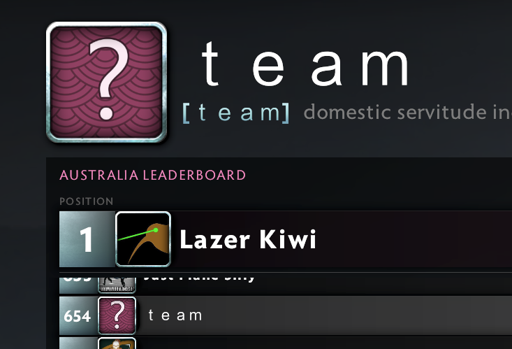
You definitely can do fun/creative things with LLMs, but they need a lot more steering/handholding. IE if you add an additional page to the lazer kiwi leaderboard, it's likely the first pass will be somewhat more generic than the homepage.

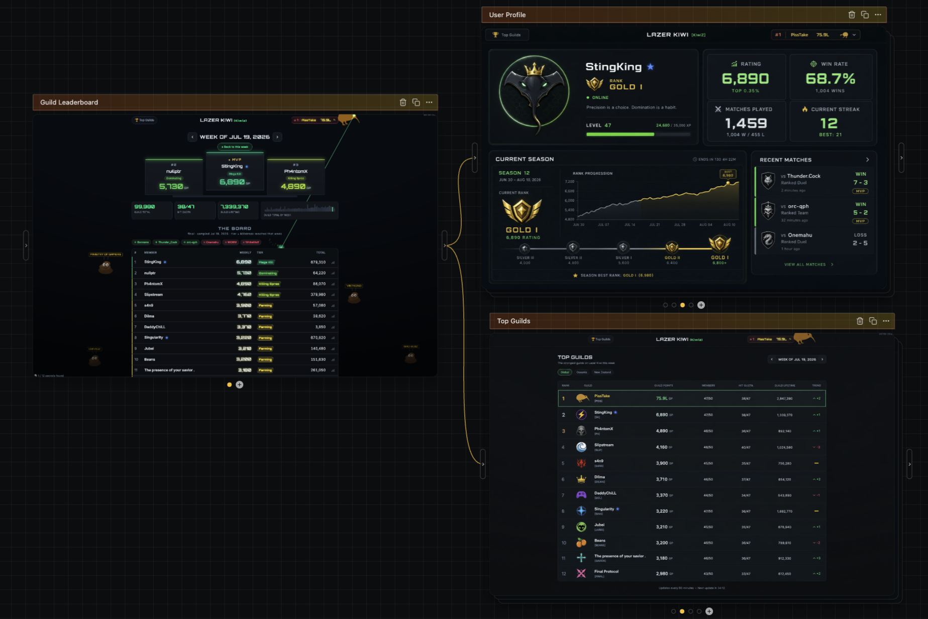
One of the other advantages of diffusion is that it does really, really well with style transfer, meaning designing additional pages in the same style ends up pretty easy. As an example, here are designs of a user profile page and a top guilds page, using the look/feel of a screenshot of your homepage: https://image.non.io/5415e0e0-9264-4bad-988e-8d9d3885b518.we...
by jjcm

7/31/2026 at 3:26:59 AM

Laser kiwi reminds me so much of the old web circa 2008. Awesome.

by the_sleaze_

7/31/2026 at 3:13:42 AM

Lazer kiwi respect!

by huey77

7/31/2026 at 12:42:56 AM

> The problem though is that LLMs write code to represent designs as well, which means you get consistent designs. You end up aligning on a generic mean because of it, which is often why you see these repeated aesthetics.

The funny thing is that looking like everyone else was once considered the definition of good UI design, because it helps users understand a new interface. Then mobile apps came and suddenly UI design was about “expressing your brand” or whatever.

by p-e-w

7/31/2026 at 1:15:52 AM

I think it's important to separate patterns from aesthetics. Patterns help us understand a new interface for sure, but aligned aethetics start to look mundane. That's why I was specifically calling out the color usage and typefaces.

I actually think the other things that Jim mentioned, such as the async task gradient / standard sidebar for agents are good things.

by jjcm

7/31/2026 at 12:52:14 AM

I like your product and I’m gonna try it because I’m growing to hate the “Claude generated website aesthetic” but $0.13 is way too cheap.

by chadash

7/31/2026 at 1:03:55 AM

Ha! Totally fair. 13 cents is 0% margin, which is what I'm targeting for individual plans.

I literally just got my SOC2 compliance complete an hour ago, and I'm gonna roll out team plans/enterprise plans next week (unified billing + shared brands). For teams I'm gonna charge a flat 25% margin on API costs, and for enterprise I'll have a 50% margin + minimum spend.

I think I'm going to keep the individual plans at 0% though. Realistically until my own diffusion models I'm training are the main model I'm using for generation, I'm just an API wrapper + harness. At the individual level I want to be competitive with going directly to the api and coding your own harness.

I am curious though - what would you pay per image?

by jjcm

7/31/2026 at 2:20:47 AM

Ok, so I signed in to your site and started out. The $0.13 is a bit misleading because by default it generates 4 images per “sketch” so it’s more like $0.50. So I can easily get to $5 in a session, which feels like a good amount. That’s about the amount I would pay to just play around and I like that you start me off with a few credits

If I’m using this towards something that makes me money, I’d pay a lot more, but it really depends on context. In general, I’ll spend $5 like it’s nothing, $20 if it’s nothing and it’s for a business expense, and probably $50-100 for a design scheme for my (quite small) business. I don’t know that I’m a representative sample, but I’ll put my money where my mouth is, because I just added an extra $5 to play around more.

Btw, it’s a really innovative interface. It’s fun and very different from other tools I’ve seen. I quite like it but it’s also a bit confusing. Feel free to contact me if you want customer feedback (info in profile).

by chadash

7/31/2026 at 5:09:39 AM

The cost-plus pricing strategy! Besides Cuban's Cost Plus Drugs, haven't encountered it much at all. Hope you start a trend.

https://en.wikipedia.org/wiki/Cost-plus_pricing / https://www.costplusdrugs.com

by Barbing

7/31/2026 at 2:08:26 PM

Is it just me, or is "cost plus drugs" a horrible name?

I know they probably intend it as "[Cost-plus] drugs", but I can't help but read it as "I'll do the job for you for the material cost, plus some drugs".

by crote

7/31/2026 at 4:53:23 PM

This chain dropped the “cost plus“: https://en.wikipedia.org/wiki/World_Market_(store)

But “Drugs” wouldn’t be perfect…

Anyway no but now that you mention it maybe it’s too wonky of a name. Nothing better coming to the top of my head right now.

by Barbing

7/31/2026 at 3:12:39 AM

It literally is not though, it takes $0.50 for generating 4 images. That's on par for any image model by frontier labs. Probably just covering their costs right now but will keep rising it over time if the tool gets adopted. But it is not too cheap when you consider the sheer amount of variations one will make if they use this in a professional design capacity. The quality of the tool is not what this comment speaks on since i have not tried it yet but it is not "way too cheap" in any real sense given the pricing.

by altmanaltman

7/31/2026 at 3:34:12 AM

I think that's fair, but if you add a lot of value on top, a higher price is justified. Would I pay $5 for a great looking homepage, even if I only have to generate 12 images at $0.13 ($1.56 total) to get there? Yes.

Sometimes models are vastly underpriced. Fable is an example. I can easily spend hundreds of dollars using it to code. On the other hand, if I'm looking for AI to review a contract for any obvious mistakes, I don't really care if I spend $0.01 vs $1.00, even if the difference is only marginal. I'll pay quite a bit more for something that's just a little bit better.

Same thing with design, in many cases. When the absolute dollar amounts are small, I'm happy to pay more for even marginally better quality.

by chadash

7/31/2026 at 4:02:53 AM

I understand but you are thinking design and coding maps neatly one to one when it absolutely doesn't. If you don't care if the cost goes up 100x, of course it is too cheap for you. But that is not how everyone looks at costs even for marginal things esp at scale.

by altmanaltman

7/31/2026 at 1:28:22 AM

I wanted to try out your service but I don't have any accounts with Google or Microsoft properties (incl Github), so I can't sign up

by motoroco

7/31/2026 at 12:24:36 AM

How do you prompt your diffusion models? I see that you are a founder in this space :)

by sebmellen

7/31/2026 at 1:06:41 AM

A few layers to it. When you prompt on my product I expand out that prompt into a semantic json blob that represents the style, theme, color palette, and subjects on the screen. I then feed that blob into the diffusion model itself.

The reason I feed in the json blob is it lets me better preserve subjects across multiple screens (ie you probably want to carry over the header exactly as it is in one image to another image).

The example sites above though were pretty simple. I think they were something like

"A tarot card website with an inky, painted artistic style, with rich illustrations on a card featured on the left, and a button to draw cards on the right"

and for the other it was something like,

"A cyberpunk inspired ramen cart website"

by jjcm

7/31/2026 at 1:07:09 AM

For Tarot, did you generate base-color, roughness and normal maps? How do you make sure something like the roughness map doesn't deviate slightly from the base-color?

by hijp

7/31/2026 at 1:10:57 AM

Yea. I have a very speed run version of how I made that one here: https://x.com/pwnies/status/2076755344471289898

But basically diffui's build step provides an API to create normal/roughness/depth maps from images. It's essentially an interface to fal.ai's Patina model, which does a really good job at creating those.

The one thing that's missing with it though is metalness maps (Patina can theoretically output them, but they only have a ~10% success rate I've found). I'm trying to train my own diffusion model now to help generate those so the reflectivity isn't fully uniform. I just posted very, VERY early results here - right now my model has around a ~25% succes rate: https://x.com/pwnies/status/2082980850120163756

by jjcm

7/31/2026 at 1:40:13 AM

The ramen one looks extremely AI. It's mostly the atrocious copywriting, and wonky responsiveness, but even overlooking those things you can tell.

On the Tarot one, the 3D card in the bottom is both very elaborate and also pointless. No human would've put effort into making that. Not bad per se! But AI.

by internet2000

7/31/2026 at 2:29:27 AM

Specifically, AI loves to separate headers with //

by draftsman

7/31/2026 at 5:34:28 AM

Wasn't one of the main original points of LLMs to be creative? To create stories, creative writing?

by XCSme

7/31/2026 at 6:27:43 AM

It wasn't the point, but early LLMs would make mistakes so often that writing fiction full of hilarious nonsense was one of the only applications. Now that they make mistakes less often, you need some other source of high-entropy randomness to reinject creativity into the story.

by yorwba

7/31/2026 at 11:59:53 AM

Kinda, more accurately the current goal for labs is to produce economic value to justify high valuations / capex, thus having to RL on correct answers rather than interesting ones.

If you could access the current models as base models I guess you'd still get very interesting hilarious stuff.

by weiliddat

7/31/2026 at 2:01:21 AM

Context priming all the more important for design work over raw model vanilla experience

by wahnfrieden

7/31/2026 at 6:28:54 AM

To me, neither of them feels like AI generated. The tarot example feels like its inspiration came from collectible card games, while the ramen example reminds me of Cyberpunk 2077.

by CapyToolkit

7/31/2026 at 1:11:58 AM

I was expecting Papyrus for the tarot page :)

by senderista

7/31/2026 at 12:50:18 AM

Honestly these examples absolutely DO look like generic AI slop, no offense.

by azan_

7/31/2026 at 12:59:39 AM

I think that if the images were replaced by human made (you can take photos of real things if you don’t want to draw or hire an actual artist) perhaps the design could be more passable

by a1o

7/31/2026 at 1:07:51 AM

I think the neon ramen example looks pretty awesome.

by matheusmoreira

7/31/2026 at 3:38:23 AM

To me it looks exactly like a cluttered LLM generated one.

by vips7L

7/31/2026 at 1:20:22 AM

It's a copy of cyberpunk 2077 aesthetic (which if you search on google you'll see many css + component libraries trying to recreate it).

by shimman

7/31/2026 at 1:17:30 AM

ty ty, though I do agree with azan that the imagery inside of it looks generated (as it is).

That was really a test of whether or not newer models could implement box shapes that aren't provided by CSS. Opus 5 was one of the first that really nailed that - it's been a long standing test I've had for img->html.

by jjcm

7/31/2026 at 4:17:57 AM

I hate to be crass, I’m consciously trying to avoid well defined HN guidelines here, but the article is about discussing design aesthetics we encounter when we are interacring with AI not design asthetics the AI outputs when we ask it to write code for us. I get the confusion though, the title is a bit of a trick, probably on purpose

by 40four

7/31/2026 at 4:44:19 AM

The article is covering both

> As another example, before AI what were the connotations of the sparkle emoji ? Personally, I don’t know, but now it means AI.

> For example, a lot of AI apps use tiny icons

> There are other aesthetics my brain associates with AI, like beige/cream colors, orange accents, and serif typefaces as well as whack-a-mole UI controls

Are examples of the AI outputs

> For example: streaming text

> For example, the “shimmering text”

Are examples of interacting with AI

by eddythompson80

7/31/2026 at 11:12:31 AM

I read all of these as being about interacting with AI. It says apps made by AI labs have tiny icons, not that AI-generated apps have tiny icons.

by NicuCalcea

7/31/2026 at 11:14:57 AM

I did wonder which one to put that under. It might be it own category of “made by AI company”, but I also think both Anthropic and OpenAI have been vocal about how their codex and Claude code is 100% AI generated

But how is AI outputing sparkle emoji or orange accents colors interacting with AI? Unless you also classify AI output as a form of interacting with AI

by eddythompson80

7/31/2026 at 11:30:17 AM

The sparkle emoji has become an indicator for "this is an AI feature, click here to do AI things". I have even used it.

The beige UI with orange accents probably refers to the design guidelines of Anthropic, Mistral, Microsoft AI and a bunch of other companies. They all try to use soft, non-threatening colours, and for some reason those two are a popular choice.

by NicuCalcea

7/31/2026 at 12:07:42 PM

Huh, ok. I disagree. Sparkle emoji and beige cream or orange accents every where is definitely AI output, not some “AI features here”. I don’t even see sparkle emoji on any AI websites or “features”. It’s only in sloppy output and most people will tell you to remove it because it screams slop too much.

by eddythompson80

7/31/2026 at 3:24:58 PM

Here are just a few examples I found in a couple of minutes:

- https://www.salesforce.com/artificial-intelligence/

- https://copilot.cloud.microsoft/

- https://upload.wikimedia.org/wikipedia/commons/7/72/Meta_AI_...
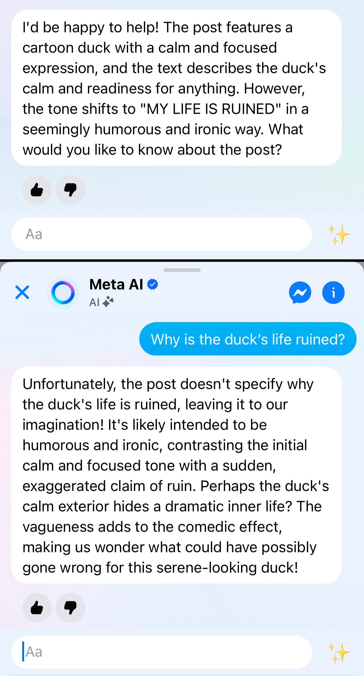
- Literally the Gemini logo

by NicuCalcea

8/1/2026 at 5:38:12 AM

I’m tempted to add to this list, but Sparkle emoji has so clearly become a ubiquitous symbol for “this feature is enhanced by AI”, I’m surprised at the push back from the other commenter.

I’ve never seen or heard anyone mention sparkle emoji as a tell-tail sign of AI generated content, in the way that you hear about em-dash for example.

But I have seen the icon used in just about every website/app that wants to let you know they are using “AI” in some form or another.

by 40four

7/31/2026 at 7:26:51 AM

> LLMs are trained to write consistent code

You are absolutely right, that's the load bearing assumption and it earns its keep.

Personally, I didn't mind when a lot of sites looked like the default Bootstrap theme (because that's what they used), because generally it made sense. I think that LLMs, both in regards to prose and the code and UIs they produce, could have lead to an age of decent - where things would be just fine and sane, the writing decent and not frustrating, the code easy to read and debug, UI whitespace and layouts would be good, fonts would be readable, usability would be great.

Instead we got AI slop writing that reads like someone turned the pop-sci/LinkedIn tone dial up to 11 and UIs that all feel like some sort of SaaS landing page.

Oh well, it could have been worse.

by KronisLV

7/31/2026 at 8:58:47 AM

Haha, spot on, but I'm still wondering how specifically "earns it keep" became such a thing. I think it's a Claude specific phenomenon for me.

by flemhans

7/31/2026 at 1:02:54 AM

> There are other aesthetics my brain associates with AI, like beige/cream colors, orange accents, and serif typefaces

First, they took my em dash. Now, they’re taking my neutral background with orange accents.

by baubino

7/31/2026 at 1:10:40 AM

Beige/cream colours and orange accents — wait, isn't that literally the HN design?

(Randomly, I love the Solarized colour schemes, so anything similar is great, vibe-coded or not.)

by ValentineC

7/31/2026 at 3:08:22 AM

They first starting appearing after Fable in my memory. The first HTML docs I generated with Fable had that cream serif with orange highlight look. I thought it looked awesome until I saw it on every other vibe-coded website...

by monk_grilla

7/31/2026 at 2:26:46 PM

Every dark mode one with the rounded boxes with the weird use of border one side to highlight but it curves around the edge and also the tiny capitalized monospaced micro-type everywhere.

by whywhywhywhy

7/31/2026 at 3:57:06 AM

Interestingly, I've found that AI has actually made me more interested in design because I'm now able to actually do some things, whereas before I couldn't get my creative visions built.

As an example, I recently built my company's website and I'm really happy with the result. I wanted it to have some hints of Rollercoaster Tycoon, and with a lot of experimentation, direction, tinkering, and examples I got to something that I really liked. Two years ago my company website would have been some generic Bootstrap thing until I hired a designer.

There's a lot to improve and certainly some aspects of it feel like AI still but it's generally gotten a lot of positive feedback and above all I really like it. Considering writing a blog post about my creative process here because I'm a dev with no design background at all.

Sharing a screenshot as to not promote: https://imgur.com/a/xqKi6X6 (in the website everything in the park moves btw)

by yakkomajuri

7/31/2026 at 10:43:12 AM

Just wanted to say, really nice design. Night and day compared to the generic starting ones linked below.

by WhrRTheBaboons

7/31/2026 at 4:02:14 PM

Thank you! Yeah it's all part of the process

by yakkomajuri

7/31/2026 at 2:40:54 PM

I love it. I'm doing similar, where I am using AI for front end work but I'm refining in 300 iterations. Removing most of the AIisms and low effort copy.

I'm rewriting my 11 year old SaaS. If anyone is interested or want to give me feedback, my contact in bio.

by tortilla

7/31/2026 at 7:25:52 AM

Thanks for not shipping your first draft!

by cadamsdotcom

7/31/2026 at 7:55:05 AM

Oh yeah I mean check these out:

https://imgur.com/a/kLKTtAz

https://imgur.com/a/9fidnRv

The rollercoaster on the second one was the breakthrough that then eventually led to what I have today

by yakkomajuri

7/31/2026 at 11:24:01 AM

The second link here is easily my favorite of the three.

by dyarosla

7/31/2026 at 10:57:24 PM

Ha interesting! Well I don't hate it but much prefer the current version ofc

But that's how taste works! It's personal

by yakkomajuri

7/31/2026 at 4:50:57 PM

Seconding the other comment, that second one is by far my favorite

by jkman

7/31/2026 at 10:56:45 PM

Well yeah I liked it as well at the time but also it feels a bit out of place? Like what does a rollercoaster have to do with this product?

by yakkomajuri

7/31/2026 at 8:55:17 AM

I think the bigger problem here is not AI, but the increasing tendency for designers and designers-groups to look at one another's work and copy it. It almost seems like every designer has an inferiority complex where they look at others and think, "I'm not as good as them, therefore I have to mimic what they do."

This results in everyone copying Apple, for example, even their bad decisions.

Somebody noticed a while ago that all the AI company logos look like anuses — and they are right! They do!

Even product design decisions are not immune to this. Look at cars for example; Tesla started designing non-circular steering wheels and everybody followed. There is absolutely no reason to do this. A non-circular steering wheel in a road car is worse in every respect than a circle shape, yet everybody does it until the trend passes (hopefully soon).

If you look around, you will find plenty other examples.

Similarly here, I think that all AI apps have small icons not because they are AI apps, but because the design groups copy each other's work.

by jwr

7/31/2026 at 2:28:22 PM

[flagged]

by h2aichat

7/31/2026 at 12:13:20 AM

> For example, there’s the hamburger menu (≡) which saw a proliferation during the rise of mobile due to the constraints around screen size.

Speaking of this, GitHub replaced theirs with a pancake emoji.

Maybe related to the stacked pull-requests announcement earlier today.

by guessmyname

7/31/2026 at 12:36:24 AM

That’s what that was. I thought someone there screwed up an image path.

by genghisjahn

7/31/2026 at 1:01:45 AM

Did they write anywhere about it? I noticed it - and I think it uses the system emoji, because I noticed the pancake was different between my systems.

by a1o

7/31/2026 at 3:10:54 AM

Some sites use “the waffle”.

Weird that they’re all food.

by dd8601fn

7/31/2026 at 12:14:25 AM

A lot of these things are continuations of previous trends too. The shimmering text effect is strongly reminiscent of skeleton UI, only repurposed for chat interfaces. As always, design is more continuous evolution than discrete shifts.

by AsyncBanana

7/31/2026 at 1:49:34 AM

I actually like the shimmer effect, I think it’s preferable to almost all spinners.

If the agent is set up to properly show intent then this is better than spinners or exponentially decreasing loading bars.

by data-ottawa

7/31/2026 at 2:00:40 AM

Shimmer effect is <marquee> for AI.

by ModernMech

8/1/2026 at 11:39:01 AM

I liked marquee too… I might have poor taste lol

by data-ottawa

7/31/2026 at 12:38:22 AM

As the saying goes: Slowly, then all at once.

by collingreen

7/31/2026 at 3:19:53 AM

Good UX abstractions out perform bad ones, which means they endure, are copied, and eventually become the implied standard UX… some examples of this are; the hamburger menu, tiny icons and auto-scroll for streaming text

by gitgud

7/31/2026 at 3:43:33 AM

> Good UX abstractions out perform bad ones

And then get get every precision input being represented by a slider versus text box.

by JumpCrisscross

7/31/2026 at 3:37:13 AM

Doesn't necessarily have to be good. Can also propagate and become "standardised" if it's the easiest, most convenient, most well documented way. Eg. Twitter Bootstrap.

by markdown

7/31/2026 at 12:42:17 PM

Hamburger menu is not a good UX abstraction, that's why the mass usage stage of it was pretty short lived and most people are leaving it for more obvious patterns, like tab bars

by toymin

7/31/2026 at 4:19:33 AM

Why are tiny icons good abstractions?

by r0b05

7/31/2026 at 4:49:39 AM

I assume they signal what menu item does what, to make it less confusing on different screen sizes.

I.e. Large displays get “icon + label”, whereas small displays just get “icon”

by gitgud

7/31/2026 at 5:22:54 AM

I believe it has to do with the size of the icons rather than placing the icon with a label. The AI trend is towards smaller icons. That being said, the more I look at the pic in the article, the more pleasing the smaller icons look to me. Perhaps we just didn't know any better.

by r0b05

7/31/2026 at 4:14:12 AM

I really hope streamed text doesn’t outperform other design patterns in places where it doesn’t make sense.

by summermusic

7/31/2026 at 8:58:53 AM

I might be an old man yelling at cloud, but for things coming after win98 era this feels demonstrably false in many cases.

by IsTom

7/31/2026 at 12:40:07 AM

There's definitely a lot of AI-generated websites, especially for dev tools & SaaS, that love to have dark backgrounds, cool colors (purple especially is making a resurgence it seems), and tons of fancy UI widgets.

by dgunay

7/31/2026 at 2:50:27 AM

Web devs gonna focus on web dev things. But, I’m more interested in the works of artists like https://www.rooperainisto.com/ and https://andreaciulu.com/ who embraced the glitchy aesthetic of early AI image generation and made it integral to their art instead of fighting it.

by aenvoker

7/31/2026 at 10:34:15 AM

I miss the short era of glitchy dream-like AI images. I wish we'd never moved into real-ish, uncanny valley era.

by djeastm

7/31/2026 at 3:26:11 AM

lol this is actually my art(slop). I "prompted" it from the internet and it materialized on my screen. I own it, please don't misattribute it.

by rsoto2

7/31/2026 at 12:53:29 AM

This is mostly just the 2010-2024 SaaS aesthetic. AI was trained on it and so is picking it up.

by paxys

7/31/2026 at 2:06:23 AM

Yeah. Though I wonder how capable AI is of evolving past? Especially as the content it outputs fortifies the training data that gets scraped.

by causal

7/31/2026 at 12:17:03 AM

The defining "AI" aesthetic is the TUI, for better or worse.

The real question is what the post-AI aesthetic will be, and at a guess it will bifurcate into obsessive recreations of earlier happier pre-AI times, and some sort of opposite extreme of videos of Chinese cities covered in LEDs.

by fidotron

7/31/2026 at 12:58:57 AM

Perhaps amongst coders, but I doubt most users are interacting with TUIs - my retired mother uses ChatGPT most days, but I suspect it'll be a while before she downloads Claude Code.

by ainch

7/31/2026 at 12:38:45 AM

> before AI what were the connotations of the sparkle emoji ?

It generally stood for either:

- fireworks (combined with other firework emojis,)

- birthdays/festivals (next to the birthday cake and "party popper" thing emoji,)

- magic (next to the wizard or wand, which features almost identical sparkles)

It was pretty festive. Now it's just AI, lol.

by A_D_E_P_T

7/31/2026 at 5:22:40 AM

there was also a small trend a while ago of using it to bracket tongue and cheek/sarcastic phrases, for example:

> setting your computer on fire for (sparkle) self care (sparkle)

by sweetjuly

7/31/2026 at 1:47:58 AM

For as long as the sparkle emoji has been in use I have taken it to be a red flag, the telltale sign of "buttons not to click". I can't imagine how a designer could justify including it at this point.

by ajkjk

7/31/2026 at 2:01:51 AM

And worse it's usually next to the search button or might even activate itself as "helpful" assistants

by soupspaces

7/31/2026 at 2:26:03 AM

I thought this article was going to be about graphical imagery as opposed to textual elements. I was specifically thinking about certain levels in Pragmata where they had this somewhat broken and inconsistent look that was meant to resemble AI-generated imagery, but was actually all done manually:

https://www.ign.com/articles/pragmata-contains-a-stage-thats...

by omoikane

7/31/2026 at 2:23:53 PM

> where you have desktop AI apps on the left (Claude, Codex, Cursor) and macOS apps from Apple on the right (Finder, Photos, Mail). You can see how the AI apps all have much smaller, thinner icons than their native counterparts.

This would be such a simple, easy fix too. Increase the icon size, increase the stroke width slightly, raise from light grey to white or near-white (inverse for light mode). Then it would look like the system.

by accrual

7/31/2026 at 2:44:37 PM

The point being is that the default for some reason is to use nigh-illegibly small text.

Just did a SwiftUI app with Claude and it defaulted to sub-.body font sizes pretty much everywhere.

by theshrike79

7/31/2026 at 12:23:59 AM

Tangent but, I still know plenty of people who are not aware of the "hamburger menu" and also do not know it as such or reference it as such.

The bubble in tech is pretty strange but I digress

by hmokiguess

7/31/2026 at 1:16:42 AM

I think that most early AI aesthetic will go the way of bootstrap and become associated with ultra utilitarian software where no one thought about intentionally making a design.

Fable can easily generate something like a design system for itself from whatever starting point you give it. So if you want different aesthetic, you can bang out the aesthetic first in Claude Design and then serve it to Claude Code to follow. It will follow.

by blfr

7/31/2026 at 1:33:59 AM

I would say by default, the AI aesthetic is the opposite of utilitarian. It adds so much unnecessary bits and bobs everywhere, random things that look reasonable at first glance but often are nonsensical noise. The visual equivalent of the endless yapping in chat.

For me it was a lot of work with Fable to keep it focused on producing a minimal, medium-high information density system. Sure, it works very well if you are just IP laundering another product, less so for more niche applications. Still super useful, but I haven't seen it produce much "intentional" design on its own.

by smoe

7/31/2026 at 4:02:41 AM

I’ve noticed much the same thing. Adding rules for ruthless minimalism and no anticipatory features helps, if context hasn’t degraded too far. Still, I tend to ask it to remove cruft much more often than I ask it to add new UI.

by dymk

7/31/2026 at 1:32:34 AM

I disagree because they communicate different things (to me).

Seeing Bootsrap for some custom software at my university pre-llm: "I think that a programmer made this and didn't have a designer helping them so they just used a library"

Seeing vibe-coded frontend: "This app may be entirely vibe coded so I am deeply suspicious of it, or it could be a programmer who didn't have a designer helping them and thus used Bootstrap"

by john01dav

7/31/2026 at 9:21:37 AM

Basic bootstrap means 'the developer did not care much about design'.

Vibe-coded frontend means 'the creator didn't care about design or potentially any aspect of this'.

by Planktonne

7/31/2026 at 10:34:51 PM

> Basic bootstrap means 'the developer did not care much about design'.

It could also reasonably mean that they consider a generic design fine. Design has many aspects, and branding/uniqueness is only one. You could, for example, have a very high quality layout of the bootstrap controls that is very easy and intuitive to use.

by john01dav

7/31/2026 at 12:39:10 AM

Another AI-ism is the use of the word "grain" in technical contexts. I'm confident the OP is human-written, but everything in my AI-supported codebase is about grains, seams, tracer bullets, and load-bearing components now.

I'd barely heard some of these words before, and now they're everywhere. It's like everyone suddenly has a friend who speaks in the same idiosyncratic way, and we're all picking up their vocal stims.

by Centigonal

7/31/2026 at 12:57:55 AM

This has been a growing problem with humans for a while. Go back ten years and use "guardrails" or "top of mind" in a conversation and you'll get baffled looks. For whatever reason the fad based enthusiasm for semi jargon is a widespread affliction.

In the english speaking world the political sides are even becoming unsubtly linguistically distinct. You can tell which way someone votes by their choice of vocabulary.

by fidotron

7/31/2026 at 12:36:00 PM

You got examples of such vocabulary?

by nojvek

7/31/2026 at 1:26:08 PM

Yikes!

by fidotron

7/31/2026 at 2:02:07 AM

> everything in my AI-supported codebase is about grains, seams, tracer bullets, and load-bearing components

Oh no. I'm afraid you may have neglected to do smoke tests.

by anon373839

7/31/2026 at 1:08:14 AM

An irony to this is that the front-ends generated by older models are gonna end up looking distinctive. If you rock a Claude Sonnet 3.7 (or was it Sonnet 4) mid-2025 purple gradient background forever you've set yourself well apart

by firasd

7/31/2026 at 2:56:04 AM

Oh no, I just realised we’re going to have a nostalgia wave for old school AI in 20 to 30 years. Well maybe not you and I but it’s gonna happen.

by left-struck

7/31/2026 at 1:11:00 AM

Would be cool to have models trained on specific eras of design, a bit like that LLM which was exclusively trained on pre-1931 text.

by olalonde

7/31/2026 at 4:44:55 AM

The AI aesthetic, is really just intensified and overused human aesthetic. Because it’s trained on our work. It’s easy to say AI this AI that, but we have too much pride to admit AI is the child inheriting average quality of human labor, often mediocre at times.

I think the rate of us seeing new stuff churning out everyday has actually lowered our sensitivity of nice things, even it’s entirely made by humans. I don’t quite get that sense of awe looking at new websites nowadays even it’s objectively well made and non-AI style. I hope this feeling won’t creep into other fields like books movies or even art.

by JbMaj9

7/31/2026 at 12:34:43 AM

Is the "'shimmering text' for waiting" thing really that recent? I feel like that is a bit older, but maybe I am wrong. I have more and more difficulty remembering how long things have been around as I get older.

by cortesoft

7/31/2026 at 3:19:05 AM

Me too, but I suppose something had to be somewhat popular for llms to regularly put it in design artifacts, now.

by dd8601fn

7/31/2026 at 8:03:01 AM

It wasn't shimmering, but the "hey I'm your computer and this is what I'm doing, oh watch, now I'm doing this" paradigm, was popular in loading screens, installers, and the explicitly personal / anthropomorphized language was on the rise for a long time.

Starting with addressing users personally instead of using neutral language like with labels in physical tools.

Also the "drawing attention" part I think mimics chat interfaces, e.g. Windows installer since Win 8.

But still no shimmering text there. Indeed interesting who started to come up with this.

Other similar, earlier trends I found:

iOS Slide-to-Unlock text!

And the shimmering of loading skeletons is also similar, although they're not text.

by moritzwarhier

7/31/2026 at 3:49:07 AM

the sparkle emoji used to mean magic or excitement or a really clean counter, and now it means a robot is thinking. we gave the most whimsical punctuation in unicode to a probability calculator

by luciana1u

7/31/2026 at 2:01:08 PM

A lot of the AI aesthetic of UX _currently_ is a function of the defaults in the skills and tools that ai agents are equipped with. That's distinct from the "AI look" for image generation which is just baked into the weights. You can get AI to build a UX with any aesthetic you want with the same design language tools that human designers use.

by empath75

7/31/2026 at 9:22:08 AM

The article doesn't mention what I think is one of the most notable AI aesthetic tropes, which is lists of bullet points where the bullets are emojis. Admittedly these mostly occur in documents (especially AI-generated repo readmes) rather than UIs, but they've become ubiquitous and I find them rather gross.

by BrenBarn

7/31/2026 at 1:41:51 PM

I love this analysis. I chalked the new aesthetic up to AI companies using a new breed/generation of highly talented and highly paid UI/UX designers who have the opportunity to bring their own flavor and influence to an emerging but extremely influential space.

by m348e912

7/31/2026 at 1:02:40 PM

Tiny icons existed in desktop interfaces long before AI.

Personally, I think they make it easier to read.

by spicyusername

7/31/2026 at 7:36:44 AM

I suspect a lot of these aesthetic baselines aren’t some kind of organic emergence from the model and more a layer of human curated fine tuning, prompting and harness adjustments to produce a positively received aesthetic in lieu of user guidance.

by msy

7/31/2026 at 12:05:14 AM

How could an article on the AI aesthetic not mention the curiously anatomical company logos?

On a more serious note, I like the tiny icon trend as depicted in the article. Those little icons next to menu text are pretty ornamental, and don't need to be as big as they usually are.

by anon373839

7/31/2026 at 12:14:24 AM

The issue with the icons is not the diameter but their stroke thickness — it should be the same as the letters.

by piskov

7/31/2026 at 12:23:24 AM

Oh, huh. I was focused on the scale but you’re right, they are kind of wispy. That reminds me of the anorexic typography trend from ~2013. It’s probably intended to convey sophistication.

by anon373839

7/31/2026 at 12:09:09 AM

The nice thing about web and electron apps is you generally get zoom for free. I like the icons as they just kind of work better for my brain.

by Waterluvian

7/31/2026 at 3:22:24 AM

I really hope AI is going to help turn the tide from this “everything runs a copy of chrome” architecture. It’s never been cheaper to build fast native UIs than right now, but everyone is still shipping web apps wrapped in chromium.

by dpark

7/31/2026 at 4:11:53 AM

Thank you, Jim. For writing an article that is digestible in one sitting! Great read.

by cat5e

7/31/2026 at 12:52:36 AM

There are like 43 tiny icon libraries and frameworks for web design. AI didn't start this trend at all. This article is just "put AI in the title and it will get attention" and apparently it works.

by ltbarcly3

7/31/2026 at 1:54:31 PM

I'm surprised I didn't see the rounded left border in this list.

It's all but a exact fingerprint of Anthropic models.

by not_a_bot_4sho

7/31/2026 at 12:39:18 PM

There are no beige/cream colors, orange accents, and serif typefaces associated with AI.

by felineflock

7/31/2026 at 3:35:39 AM

I am pretty sure the shimmering effect for loading originated in the Facebook Paper app, released in 2014.

by panic

7/31/2026 at 3:22:03 AM

> AI = sparkles and rainbow colors — it’s funny when you think about it

Never seen anyone use rainbow emoji to convey AI

by saretup

7/31/2026 at 3:57:48 AM

Not the emoji, but the text, borders, or other elements for AI features are often in rainbow colours.

by magarnicle

7/31/2026 at 12:50:38 AM

I think the article means the seahorse emoji, as we all know the unicorn emoji doesn’t exist.

by andy_ppp

7/31/2026 at 12:14:49 PM

There are other aesthetics my brain associates with AI, like beige/cream colors, orange accents, and serif typefaces as well as whack-a-mole UI controls (you know, the ones where you click the toggle and the entire UI repaints and you have to move your mouse somewhere else in the UI to click the toggle again? The non-determinism of AI’s grain has seeped into its UI/X).

Ahahaha, like this? https://monosnap.ai/file/TzFL6H6fRMfsv1G8v0mbKH2hI1kL8e

This is an HN userstyle css that I had Claude help me with. No serifs though.

by stasomatic

7/31/2026 at 10:26:11 AM

The sparkles emoji means AI???

by yewenjie

7/31/2026 at 10:28:43 AM

Yes, ChatGPT loves that shit.

by Gud

7/31/2026 at 4:24:53 AM

Sums up the whole situation nicely.

I’ve been sort of viewing these sites in a similar way I view generated advertising posters. You have no brand, you have no identity. You’re just another business in the crowd that hasn’t put any care into showing who you really are.

It makes those that put the care in stand out more. On the flip side it feels like swimming through an ocean of slop trying to get your precious attention. It’s tiring.

by cautiouscat

7/31/2026 at 4:27:02 AM

I’m just going to leave this here because many of us (myself included) are prone to going to comments first before finishing the post:

This post is in regards to the design aesthetics we encounter as users when we are interacting with AI. Not the aesthetics that AI outputs when we ask it to write code for us.

I also assumed it would be about what a “typical” front end output looks like from LLMs, but it’s not :)

by 40four

7/31/2026 at 4:55:25 AM

> As another example, before AI what were the connotations of the sparkle emoji ? Personally, I don’t know, but now it means A

I can safely say it has never once crossed my mind to think about ai when seeing sparkles

by throwaway27448

7/31/2026 at 10:31:29 AM

Hmm its really interesting, im gonna try.

by genshro

7/31/2026 at 1:08:08 PM

I use AI all the time, but I avoid the sparkle icons like the plague. Nothing good comes from accidentally hitting one of those.

by chkaloon

7/31/2026 at 3:47:09 AM

> Some patterns are very specific to the interactions inherent to the nature of AI as a technology. For example: streaming text. This is a pattern made for and refined by chat interfaces, so it may not have tons of utility for reuse across other software interaction paradigms.

I'm used to the software industry being isolated (vice versa) from the games industry, but I'm a bit surprised by this point because "streaming text" is a pattern inherent to video games running on low powered computers (i.e. 8/16 bit game consoles) and games continue to implement this as a stylistic (or aesthetic) choice today.

Then, thinking about it for more than a second:

Text streaming into view is also inherent to [slow] "network" connections, including the early internet and terminal interfaces (paper and CRT), the default way that computer text appeared for decades. These are less common, though still present today, but a keen-eyed observer [and I genuinely place Nielsen in this category] will surely have noticed the film & TV industry is still running with the trope/meme of text-appears-slowly as the best way to show computer action.

A more relevant example for a huge number of people is found on Tik Tok videos, where it's the default way for text to appear on screen[0]. Platforms desperately chasing Tik Tok have adopted the same effect -- it's a significant part of the aesthetic -- even Youtube's autogenerated captions[1][2][3] on "normal" videos.

[0] I mean "default" aesthetically, purely looking at the output. Not a "default" option like a software thing.

[1] which now come on by default if you have actual captions enabled -- it used to be like a separate language choice, like how if you select Italian subtitles it won't give you Spanish -- Valve^wYougle please fix.

[2] And these are arguably not really captions, by the way. Ignoring how wrong they are, and other issues, I'm just talking about in relation to the subject of this comment: captions and subtitles don't appear one word at a time. Show me a reasonably long phrase and let me read it. The / one / word / at / a / [music] / time / thing / is / a hippo / not / it / and / I / don't / receive / true / meaning. ('hypnotic', by the way)

[3] Yes, this is presumably AI. No, I don't think that undermines my point. It's still a choice (the people in charge did the choosing, not the confabulator), and it's a choice that goes against the extremely well established best practices for captioning as an accessibility service, as I whinged above[2].

by qwery

7/31/2026 at 9:04:28 AM

So slowness was is the reason for both old games and LLMs to use the streaming text method. Makes sense!

by flemhans

7/31/2026 at 6:26:43 AM

Let's be real

* remember the 90s internet aesthetic? geocities anyone? GIFs everywhere?

* how about the Flat Design aesthetic?

* How about the Twitter Bootstrap aesthetic?

... This too will pass ...

by harisamin

7/31/2026 at 1:28:14 AM

> They should’ve just thrown unicorns in there for the trifecta

Ah, unicorns. We've seen plenty of them throughout the AI bubble. Very apropos.

by ayaros

7/31/2026 at 12:29:27 AM

Uhh what? So shadcn, bad devs using small icons and antialiasing - I think this is all peripheral to AI aesthetics.

Midjourney has a definite aesthetic.

Minimax has one. Stable Diffusion definitely (ugly, but free )

Sora everything is rendered in Octane lol

If it’s cartoon or animated it’s Ghibli.

I have not noticed “orange” as a particular AI trend.

by cyanregiment

7/31/2026 at 1:56:56 AM

loooooooooooong landing pages is a sure tell sign of vibe coded slop, the new geocities

“you know what, ten more sections to get the point across is absolutely the right move, you’ve nailed it, and frankly, that’s rare”

by yieldcrv

7/31/2026 at 2:25:20 AM

Yep, same with code, the models are always verbose by default. Conincidentally, the output is charge per token.

Another one is a table of contents in something short.

by blt

7/31/2026 at 4:49:25 AM

Working designer here (print first, then web). The beige-serif-sparkle look predates the models — it's the 2019–2022 premium-SaaS rebrand wave, and the corpus rewarded it. What the article calls an aesthetic I'd call the absence of one: no constraint pushing back. Every strong visual tradition came from limits — lead type, CMYK, mineral pigments. I've been rebuilding a color system from traditional Korean temple pigments lately, and the constraint is the interesting part: five base colors, and every pair has to earn its contrast.

AI defaults have no friction, so everything settles on the same safe mean. "Prompt for weirder" won't fix that; real constraints might.

by dancheong

7/31/2026 at 6:56:32 AM

[flagged]

by xiaoni-liahuas

7/31/2026 at 12:05:49 AM

[flagged]

by fenestella

7/31/2026 at 4:25:02 AM

[dead]

by vladsiu

7/31/2026 at 3:10:39 AM

[flagged]

by j_aime

7/30/2026 at 11:59:57 PM

agree!

by nader

7/31/2026 at 12:28:55 AM

The tiny icons are good. There was a touch device fad that surfaced, and is subsequently dying, now that people realise that using laptop screen realestate more efficiently helps those doing actual work.

by aetherspawn

7/31/2026 at 2:16:36 AM

Agreed. Maybe I'm in the minority, but in the screenshot comparisons I greatly preferred the AI products. The Mac OS stuff seems bloated.

by strictnein

7/31/2026 at 2:58:17 AM

I had the same reaction as well, the macOS designs looked busy and cluttered. I was surprised that AI companies had landed on something more refined.

If nothing else: why is the left sidebar in macOS Liquid Glass on a raised panel? There's no need for it, and that's a whole round-rect of unnecessary visual clutter that can be removed.

by SyneRyder